James Sparkes
Product Designer
Background in a fast-paced in-house platform development environments, designing mobile apps, SaaS platforms, web apps, marketing focused websites and much more.

FIXR Platform
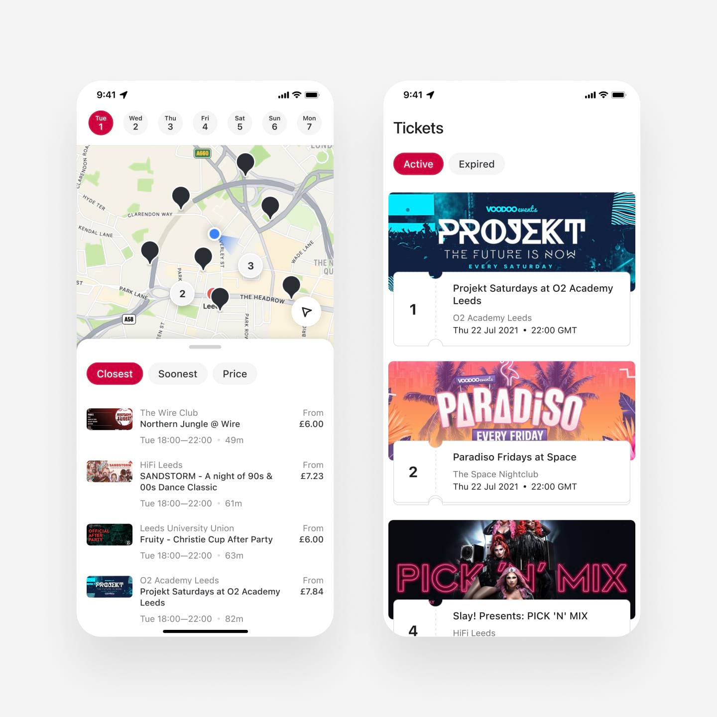
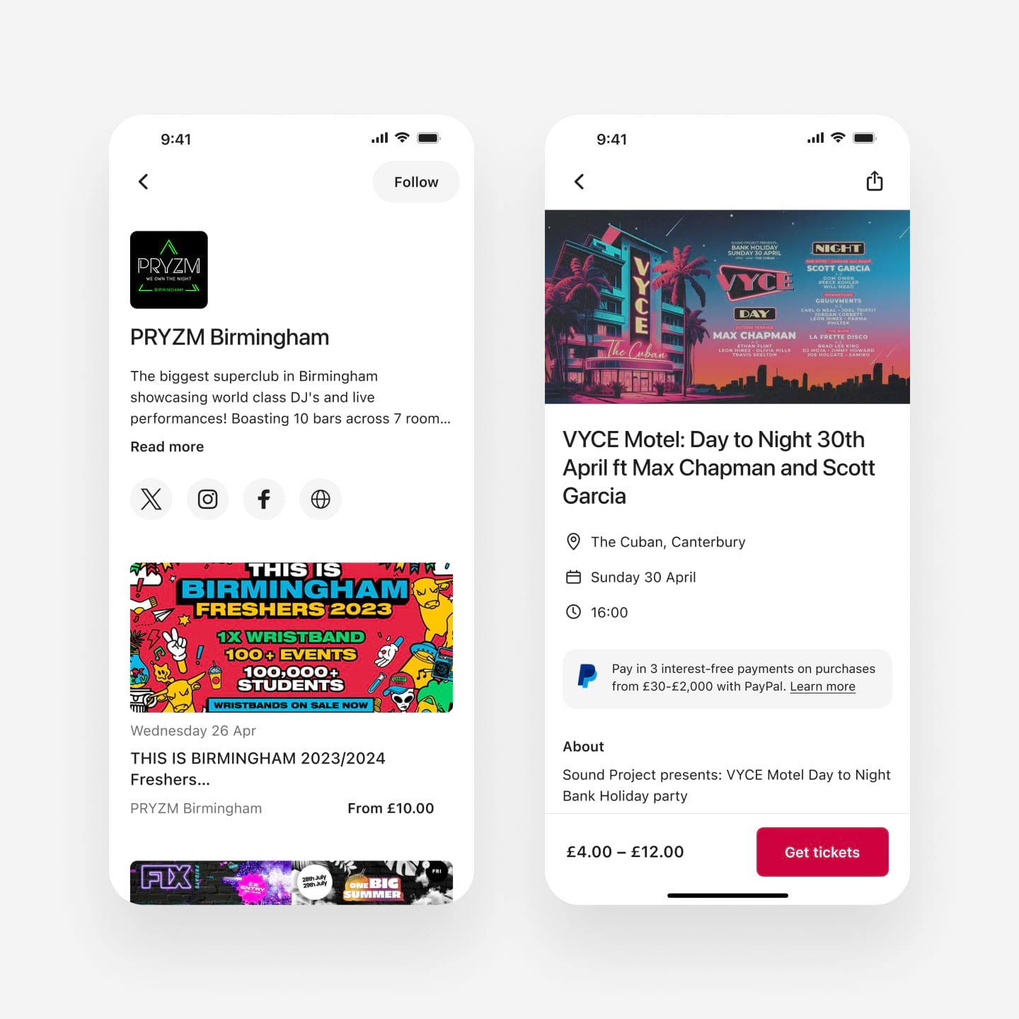
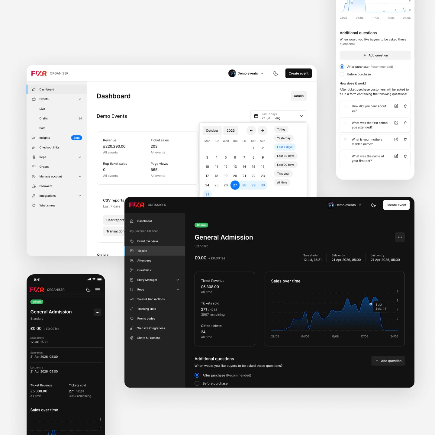
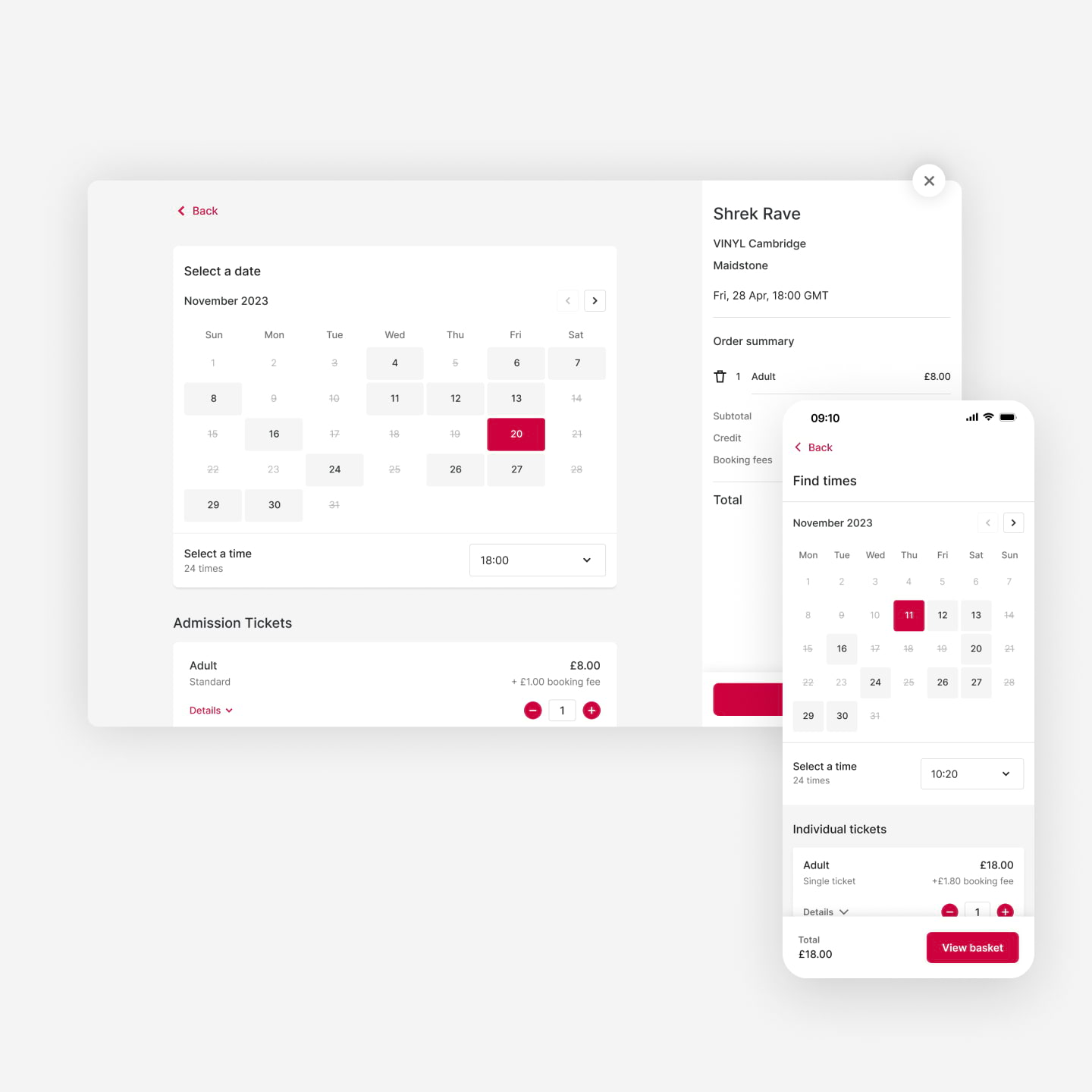
Product design of FIXR's ticket buying and management platforms for web, iOS and Android.
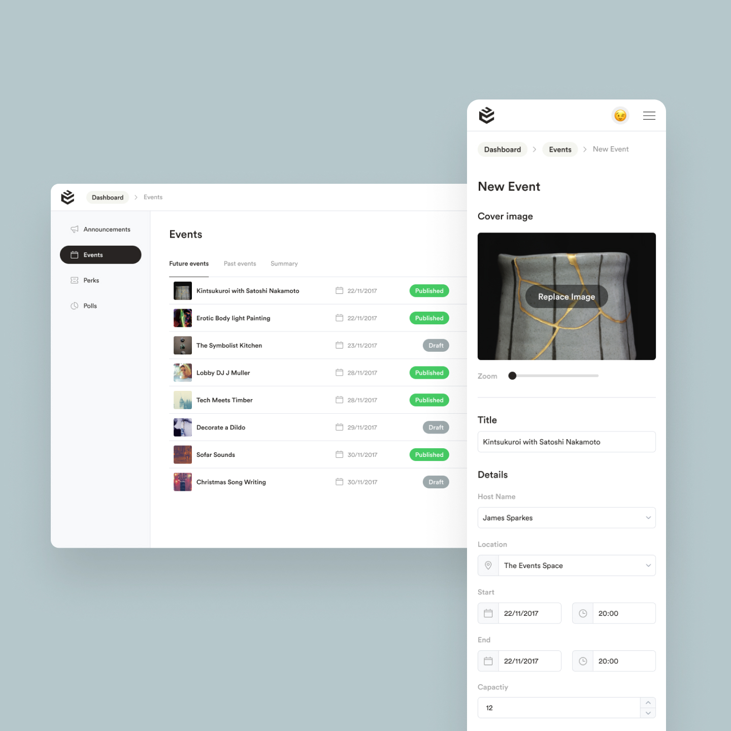
Building Management Platform
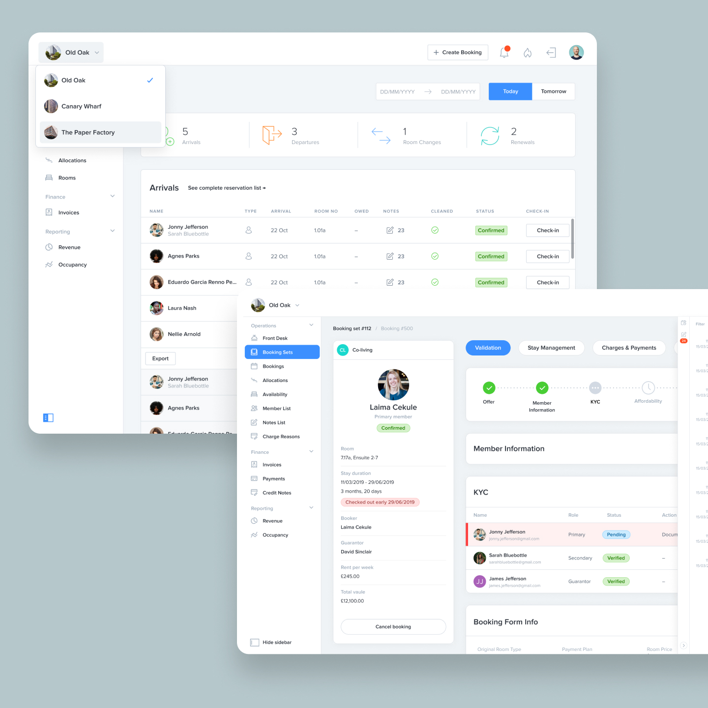
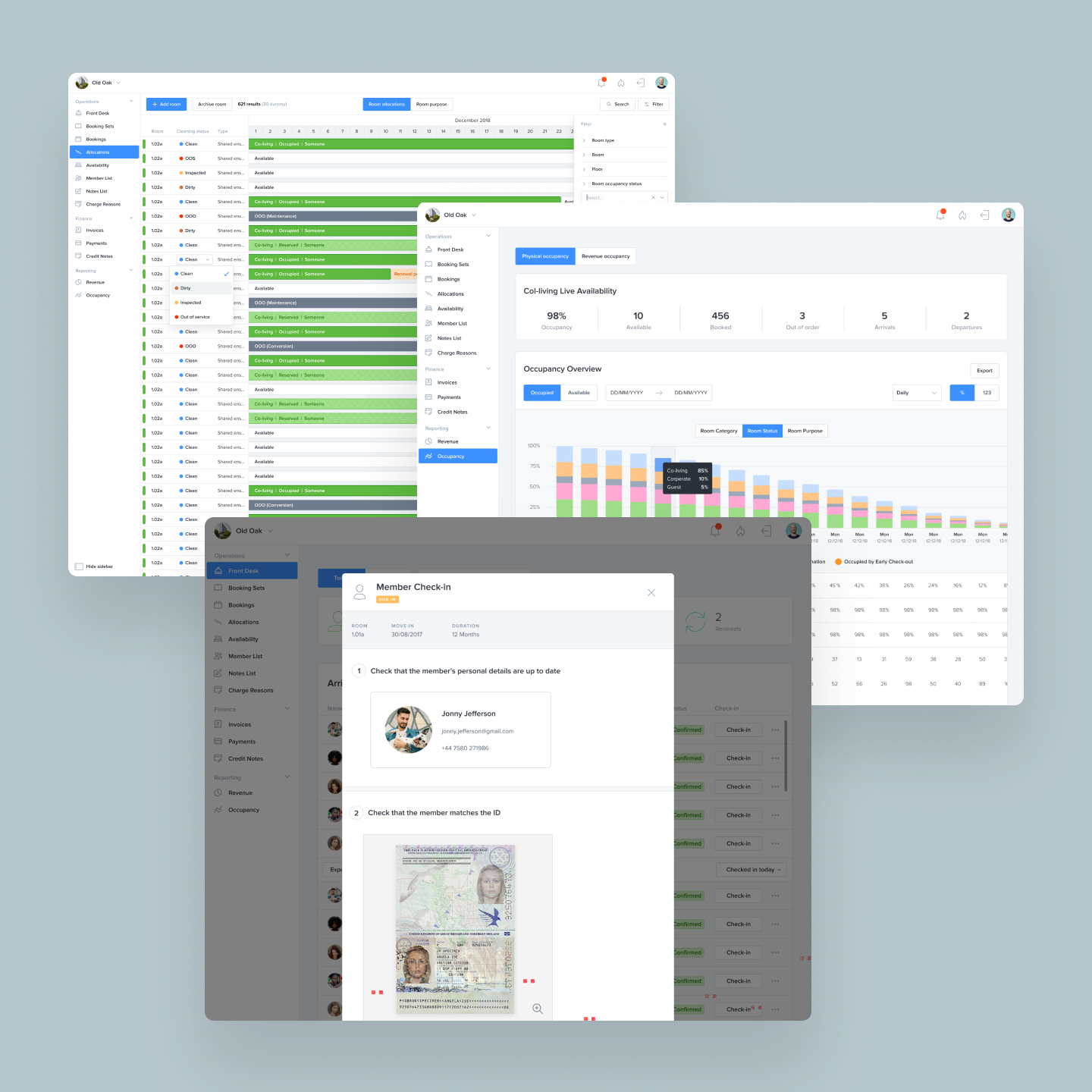
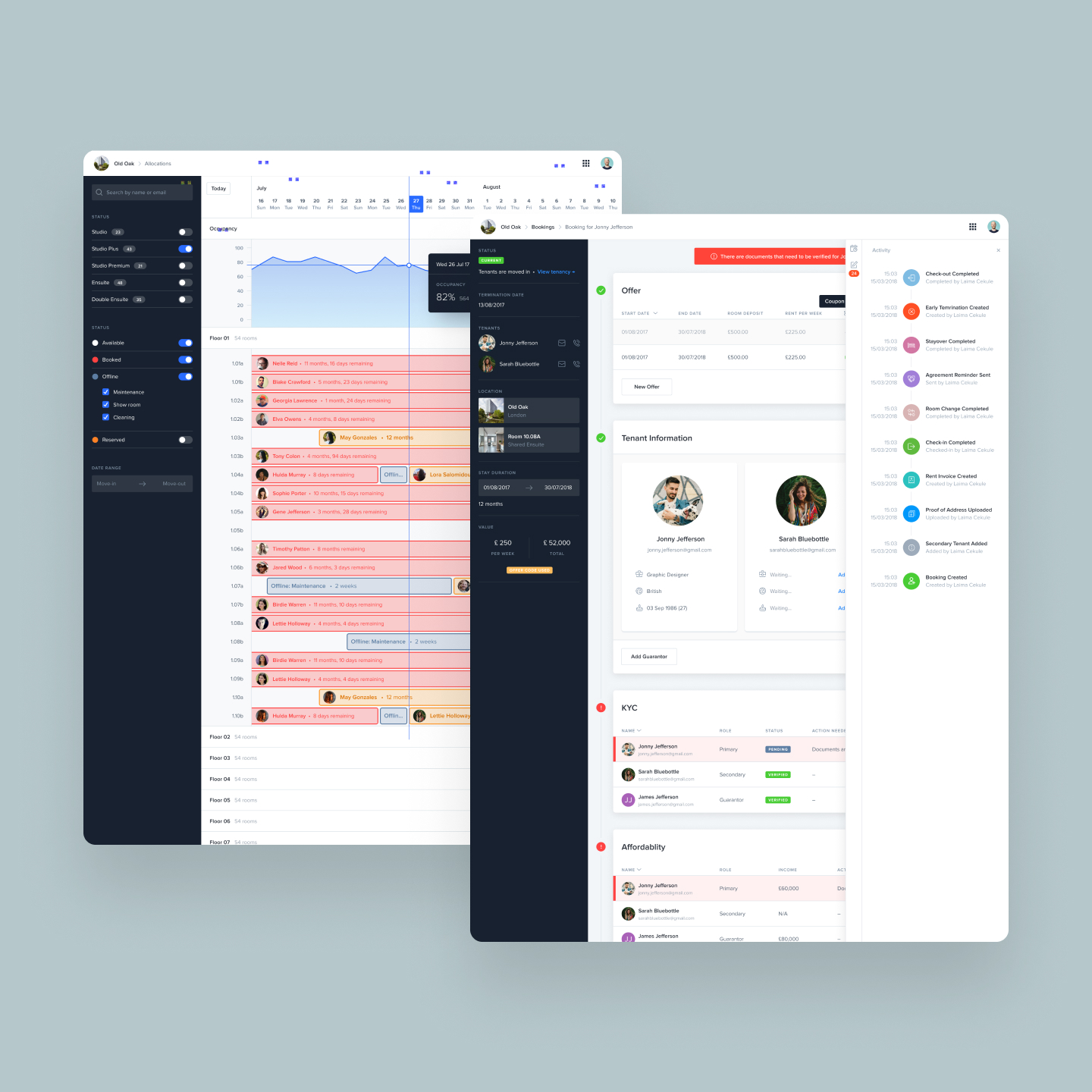
I joined the company in 2017, just as they were starting to gain traction and grow exponentially. I was originally brought in to work on their back-end data management platform which was a combination of hotel, customer and finance management software. My task was to take the existing design which was half finished and in a poor state to be handed to developers and rework the design to be coherent and make working with it easy with little training needed for staff.
I worked alongside two project managers who would give me design requirements and breakdowns of what features were needed and how they would work with the wider system. I would translate these into designs which were tested and handed over to a development team where I would work closely with them to ensure high quality output.
The initial launch was met with a big success with many employees complimenting me on the design saying it was one of the most easy to use management platforms they had used. Over the years it would go through another major rewrite and thus redesign as we continuously took feedback from staff, improved and added features such as building out the financial side, analytics and booking management aspects until it became a viable SaaS platform for other similar companies.
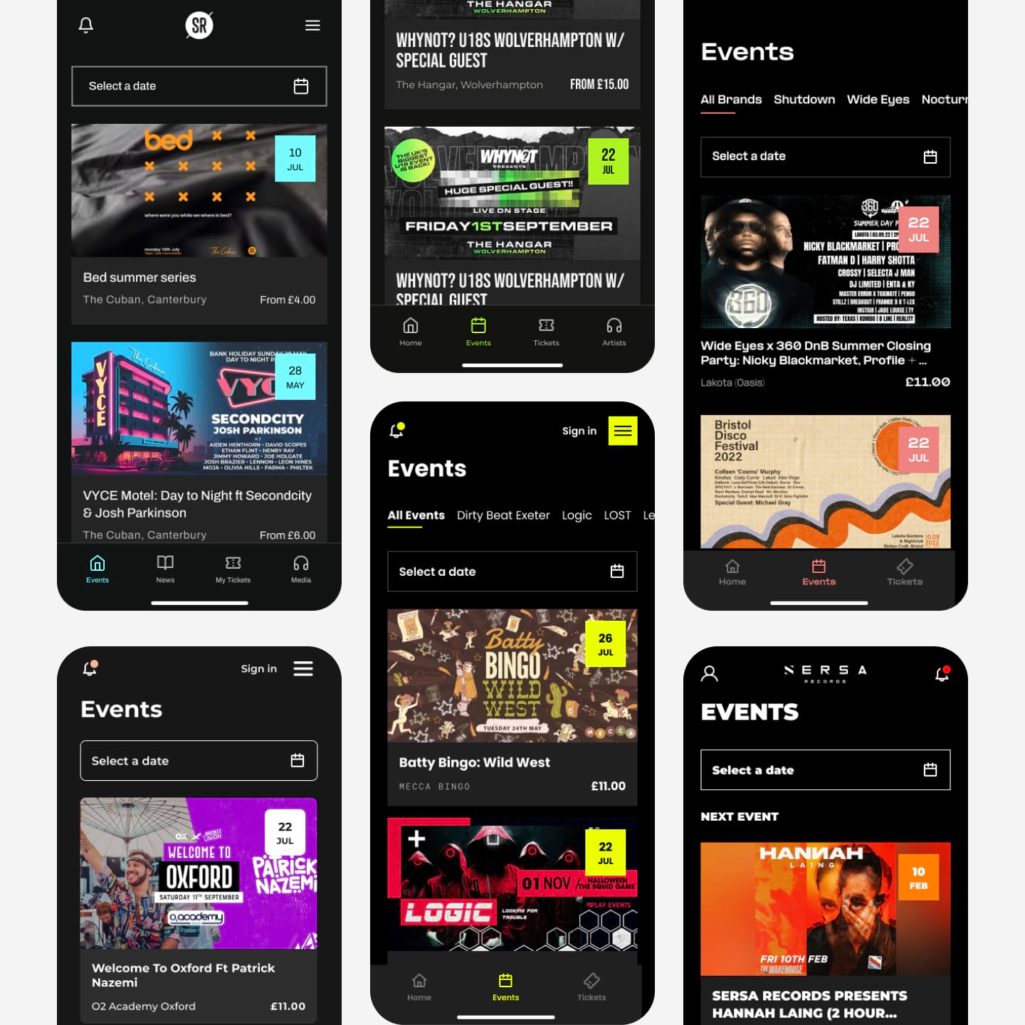
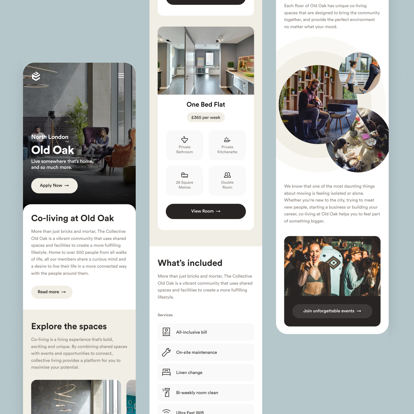
Community App
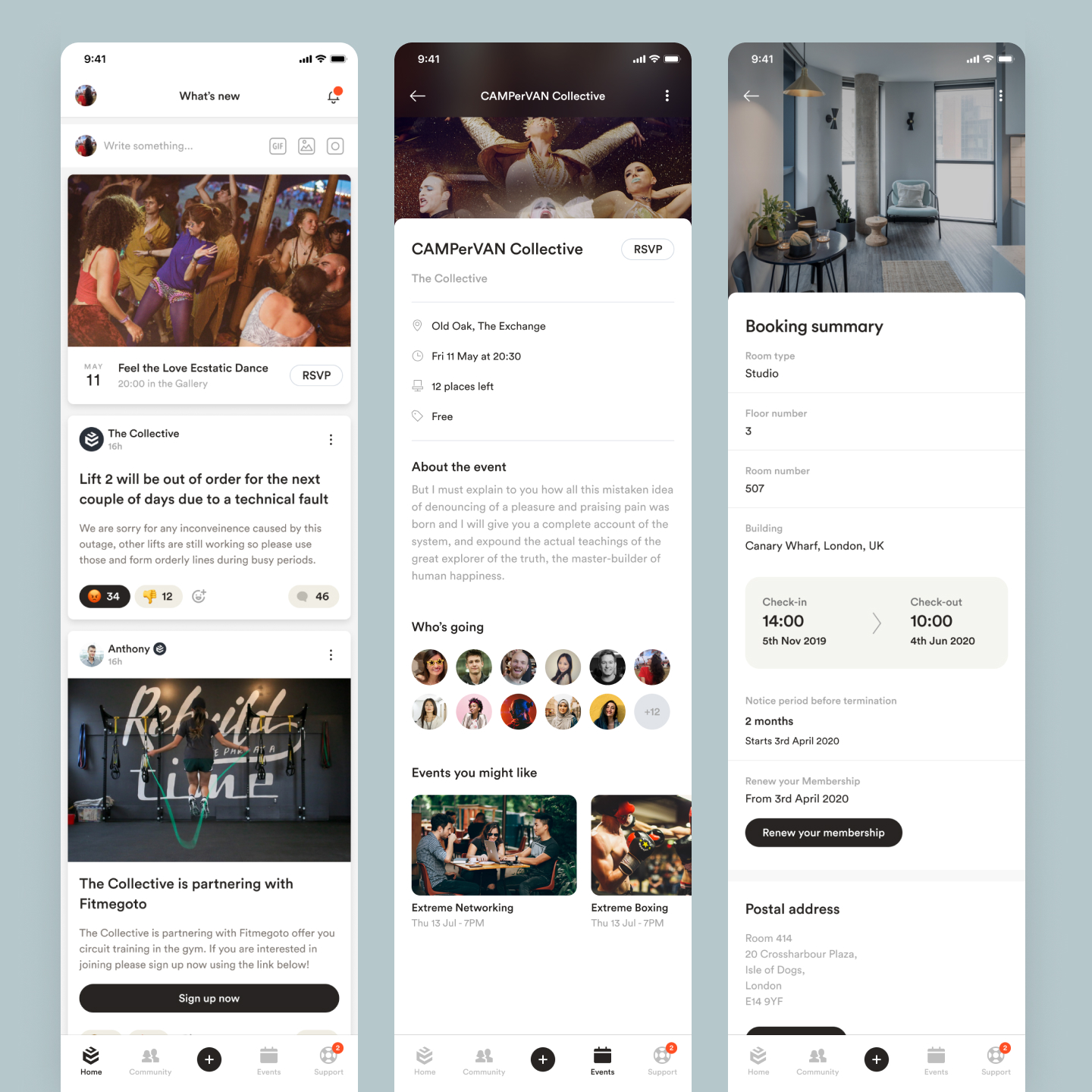
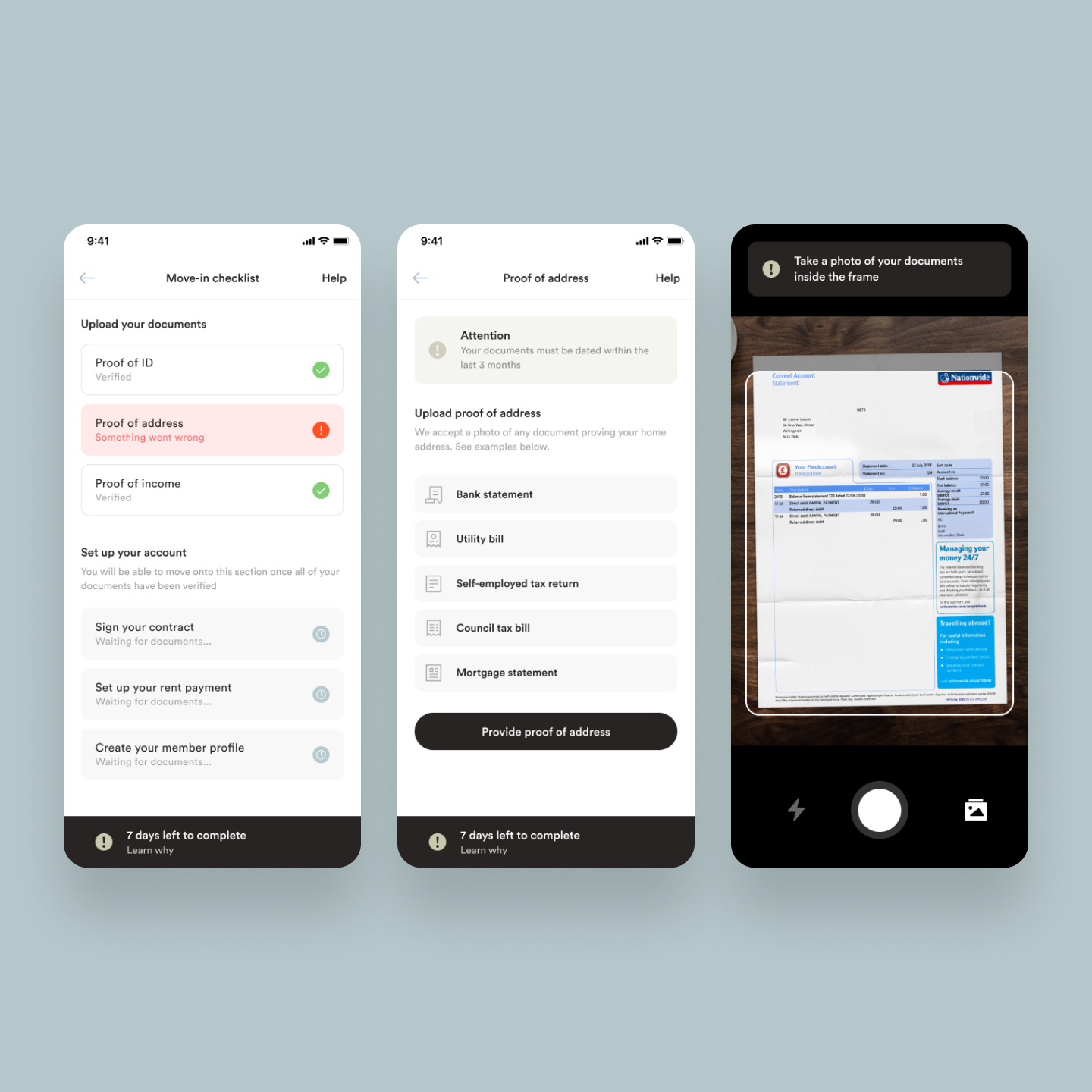
The company had promised its residents an app to facilitate many functions of their community focused apartment building. I was paired with a project manager to conduct research into what was expected from the residents and the staff who would be using the app as their primary way of interacting with each other. The scope was to create an MVP to be designed and developed within 3 months and released to test the viability of having a social app.
When the app was released it was a success with beta testers and focus groups we conducted and were excited for more features from the roadmap to be shipped. Over the course of the next year we increased our development capabilities and fleshed out many aspects of the app from the onboard experience when residents move in, to communicating via interest groups, messaging each other, an events platform and a robust help and support system.
The app was under continuous development and the team grew over the years adding in-house developers, going through multiple redesigns, rewrites of the code and shifts in focus of features to accommodate business needs. A lightweight content management system was also managed and designed by myself for staff to use to interact with the app and users.
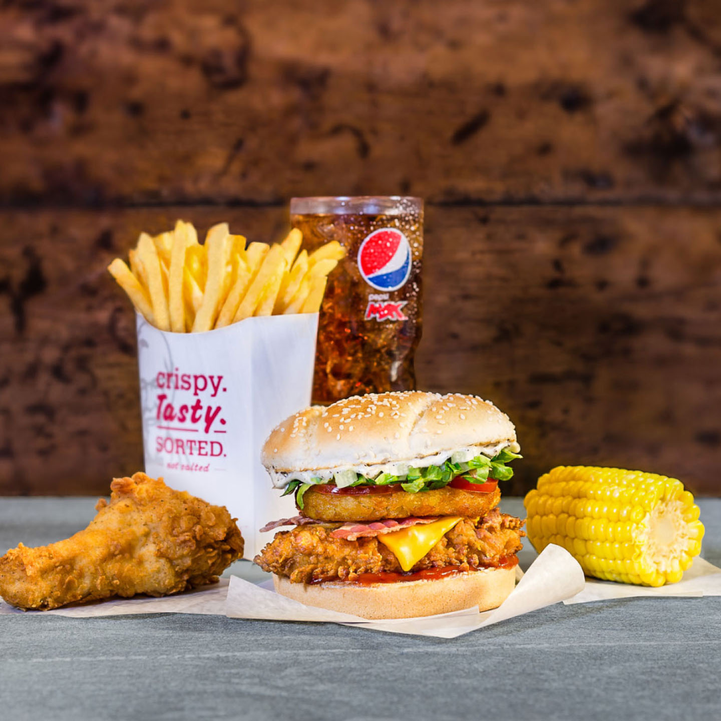
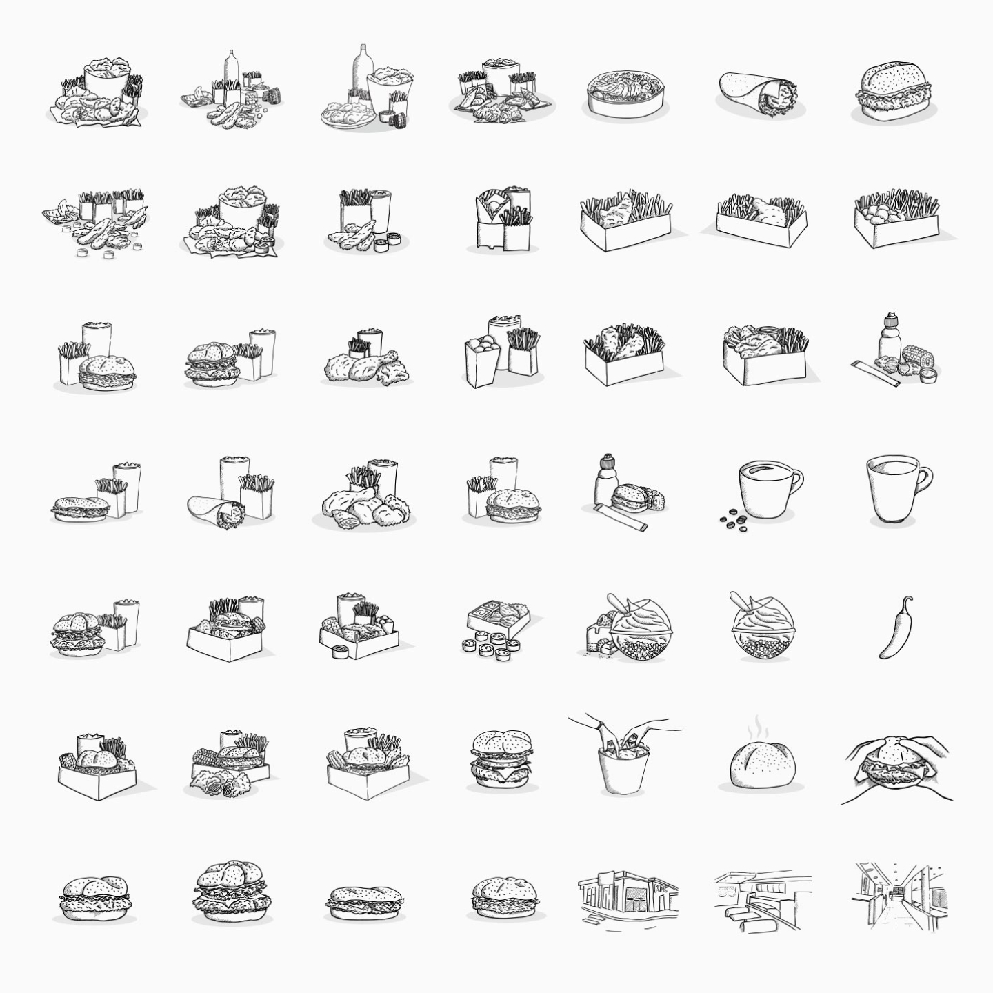
Marketing Website

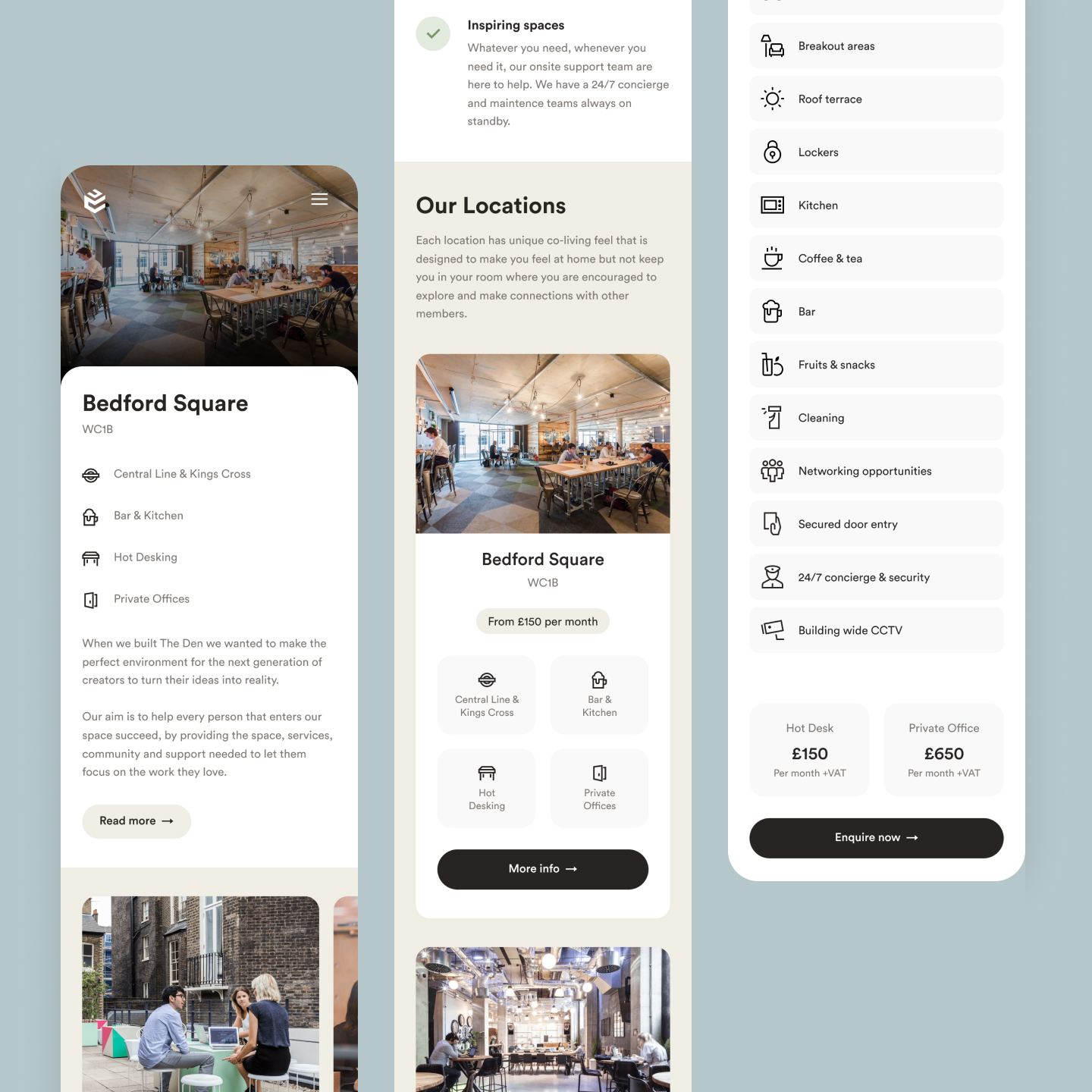

The company was fast growing and expanding, it was decided there needed to be a new website created as the old one was slow, outdated and had no way of being changed.
UX was carefully crafted to ensure potential customers could easily learn about the company’s unique offering and also see as much as they can to get them funnelled through into the sales flow.
In addition to the main website which covered sections for selling rooms, there were also events and workspaces and various microsites which were designed for different purposes and target demographics.
Kuula TV
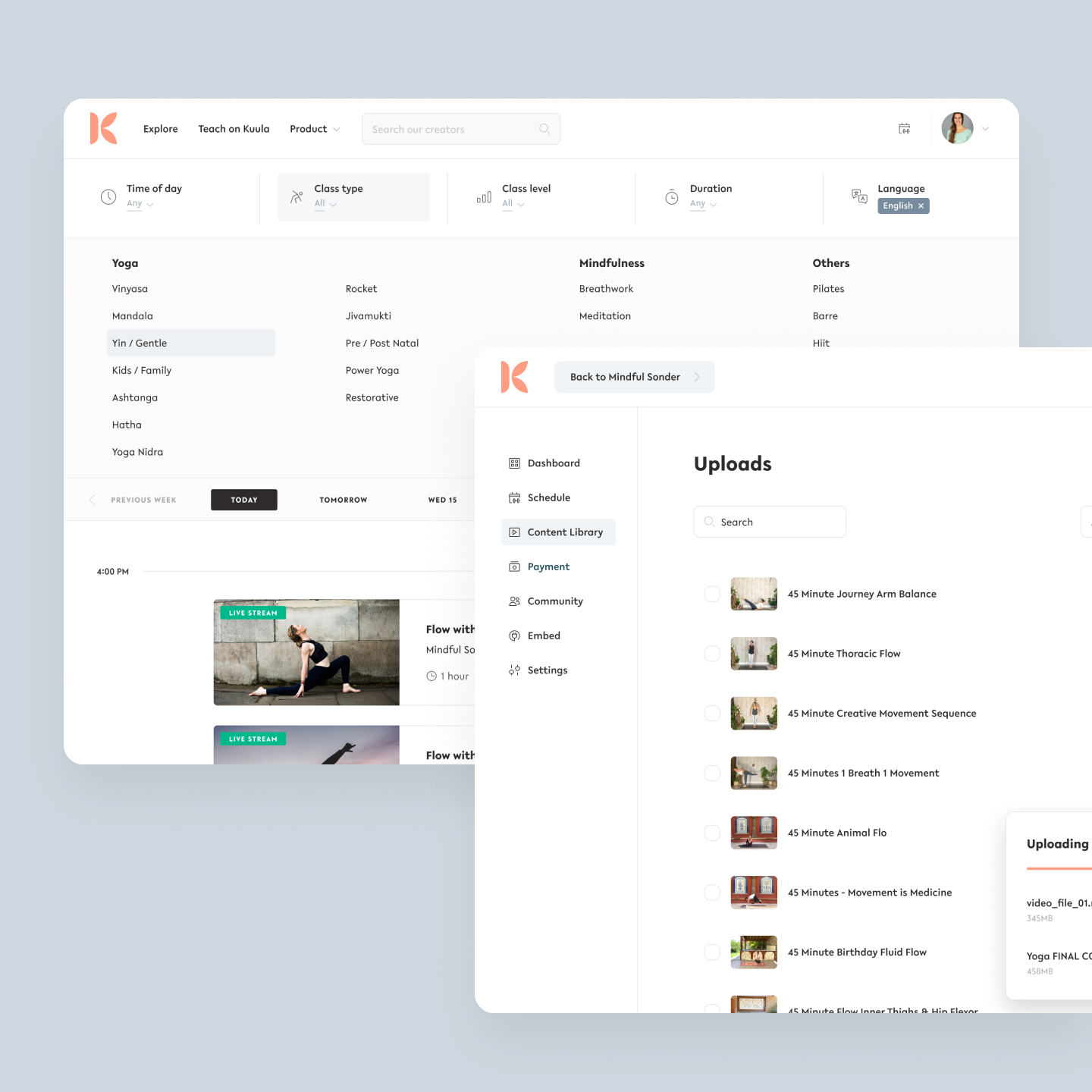
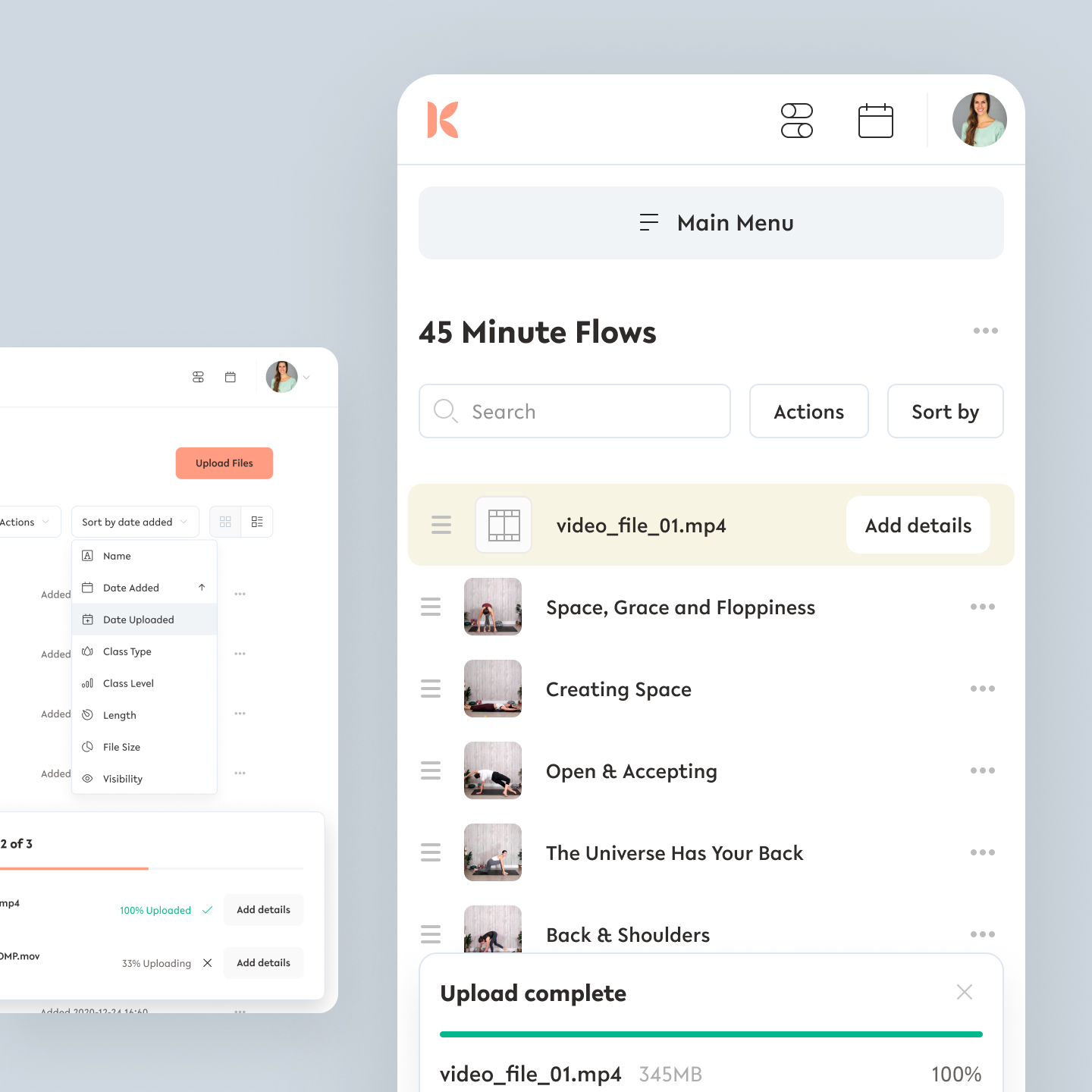
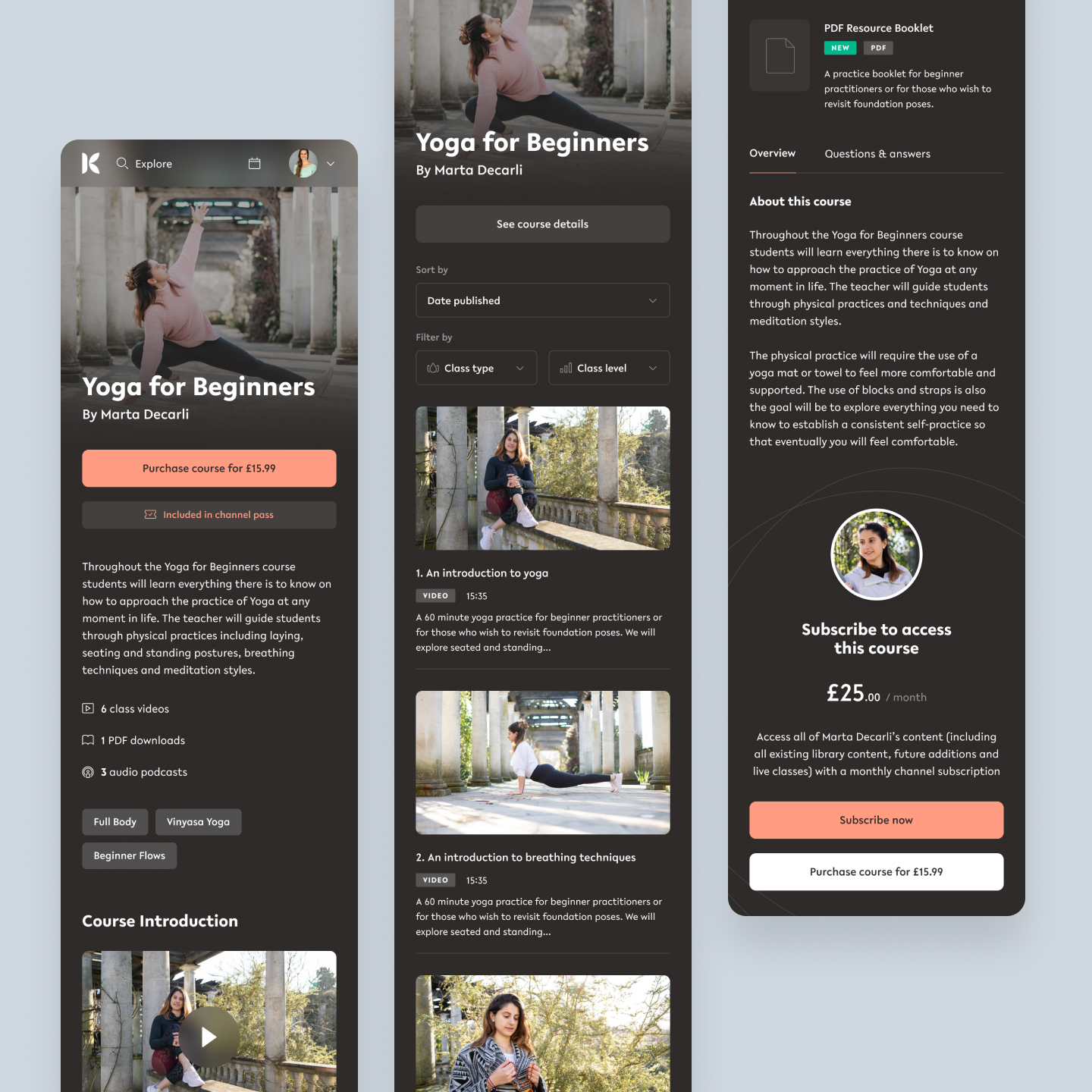
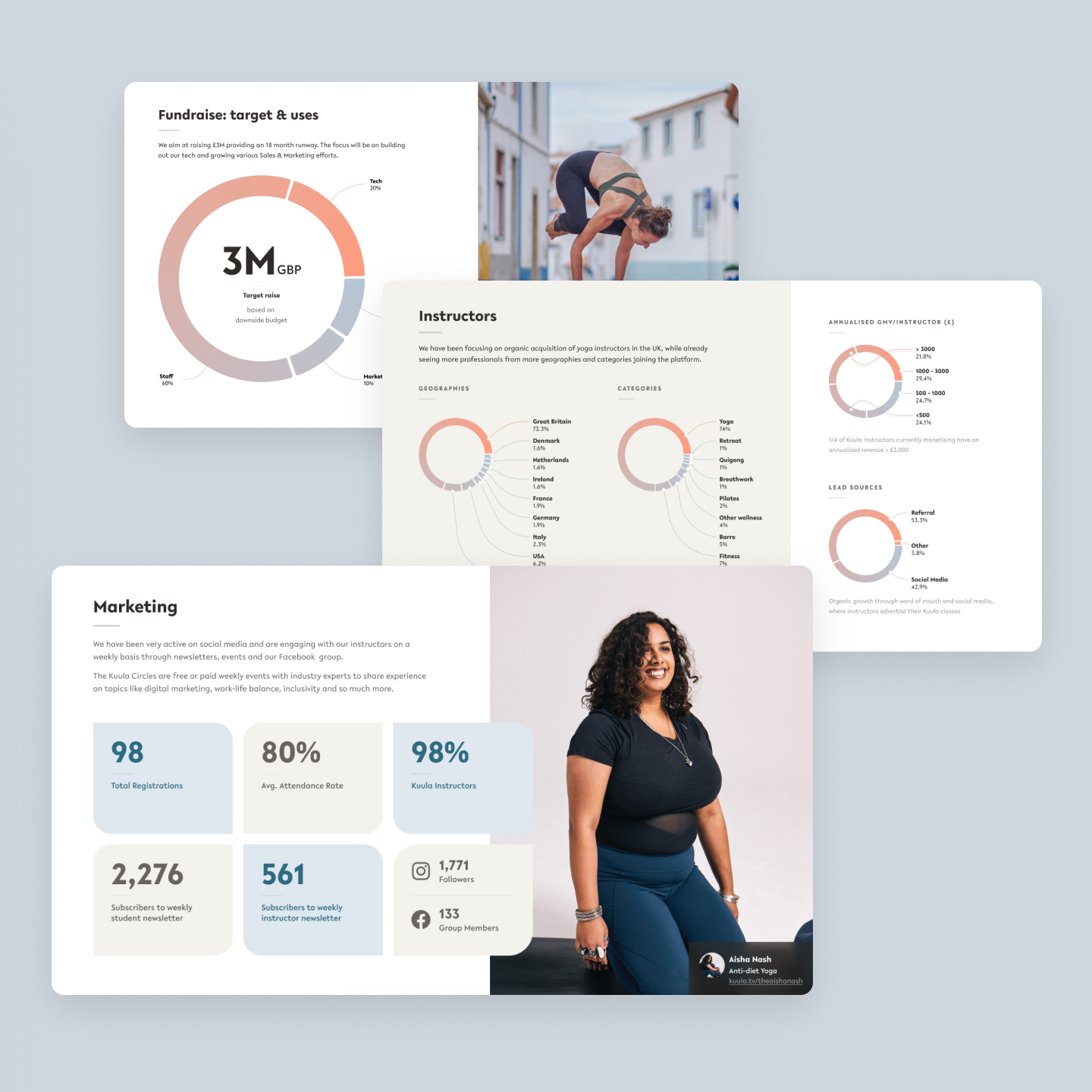
During my time working for Kuula I worked on the initial stages of branding and UI look and feel as well as working on designs for their main marketing website, sub brand microsites for partners along with UX and UI design of a media file system.
I worked on the website and management side of the platform, helping to set up and contributing to the design system. I was tasked with making sure viewers could easily tell the difference between different types of content such as courses and video collections, making sure these could be easily sorted as they could often comprise many videos and other file types such as PDFs, images and even audio files.
One of the biggest parts of this project was reimagining the system for users uploading their videos. As this was one of the largest aspects of what users would be doing on the site it was important to make uploading, naming, categorising and sorting their content in an easy and streamlined way. There were a lot of challenges especially when taking into account a lot of users uploaded directly from their phones. Some rudimentary video editing features were designed into the interface after upload.
Breezie
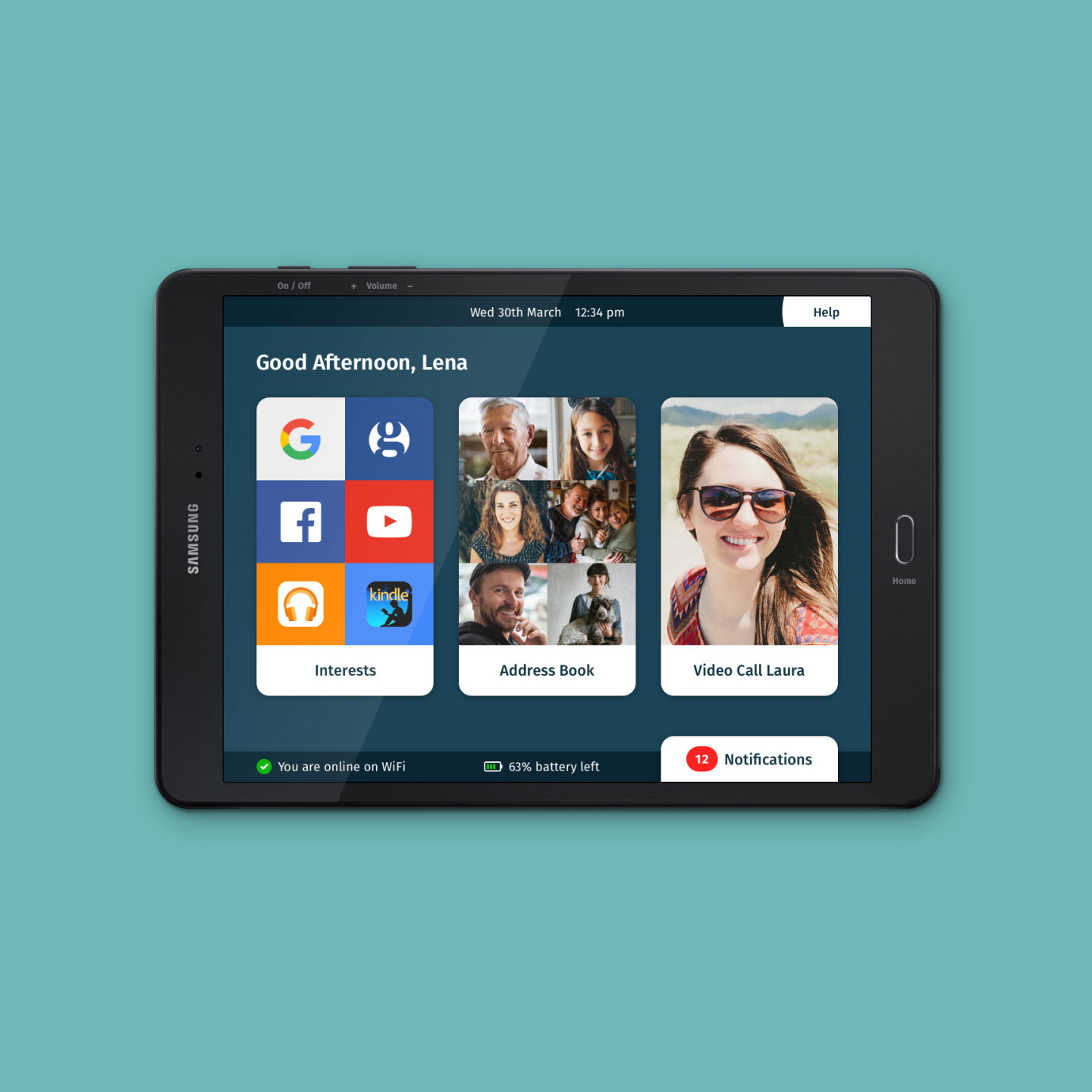
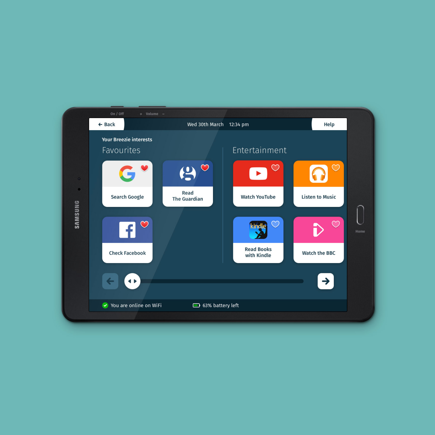
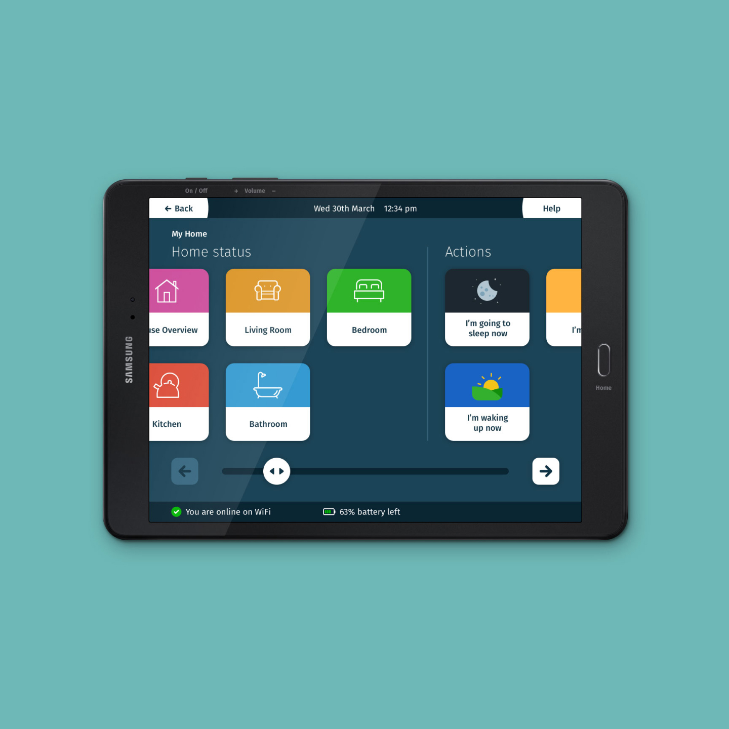
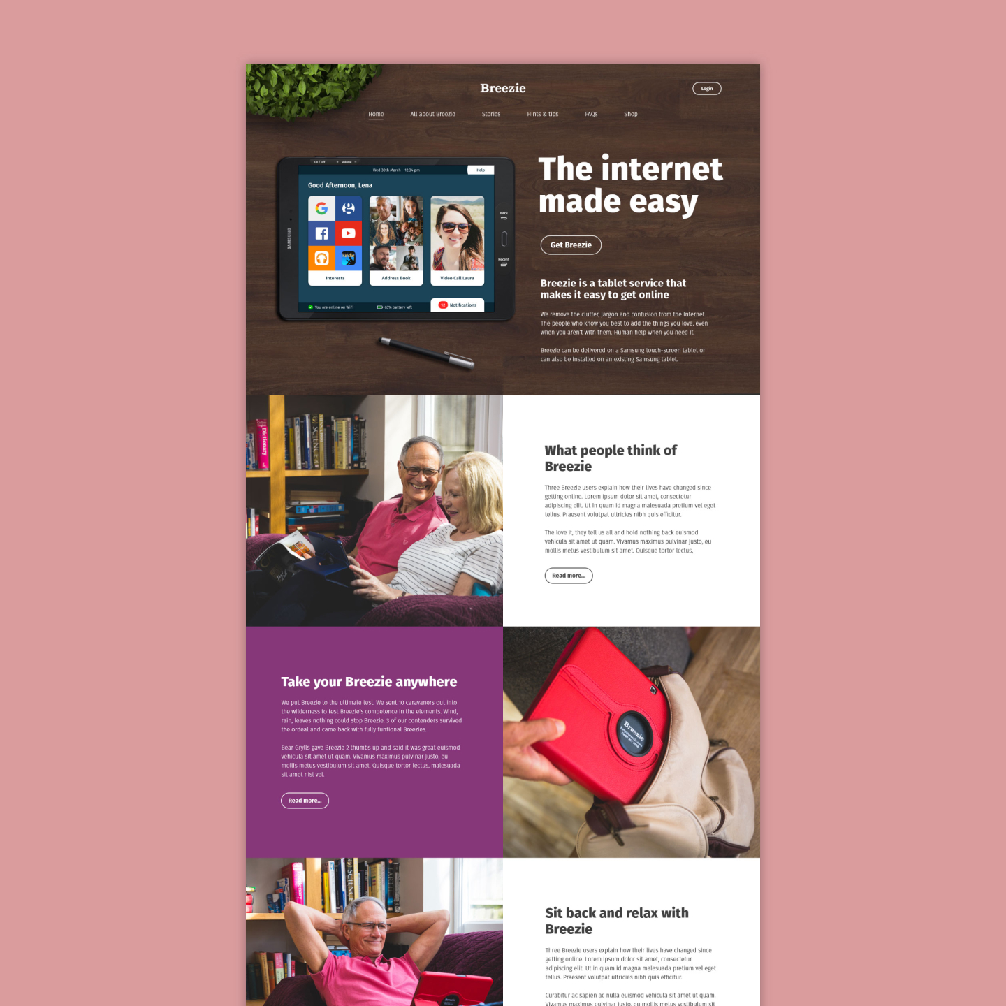
Breezie was an Android based operating system targeted towards elderly and disabled. Along with another designer we both worked on overhauling the UX and UI design from the ground up based on our own research conducting with existing elderly users of the old OS and also with users who were put off from using other tablets and computers to learn from them what we can do to make the new design more usable and useful for their lifestyles.
I worked on concepts such as scalability for users who were unfamiliar with digital tablets to have limited functionality but then functions and features added as time went on as they got more familiar and they wanted to have more things on their screen. Functions were generally added and maintained by family members using an online content management system to add or remove things depending on what their relative wants or needs.
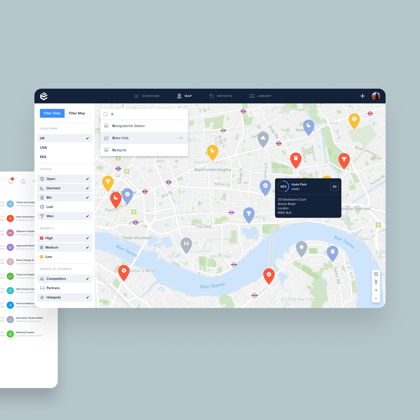
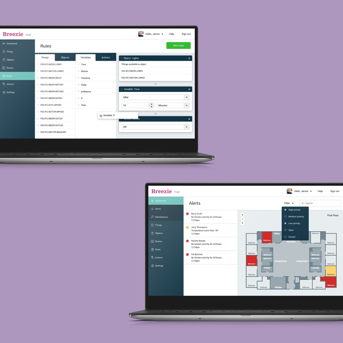
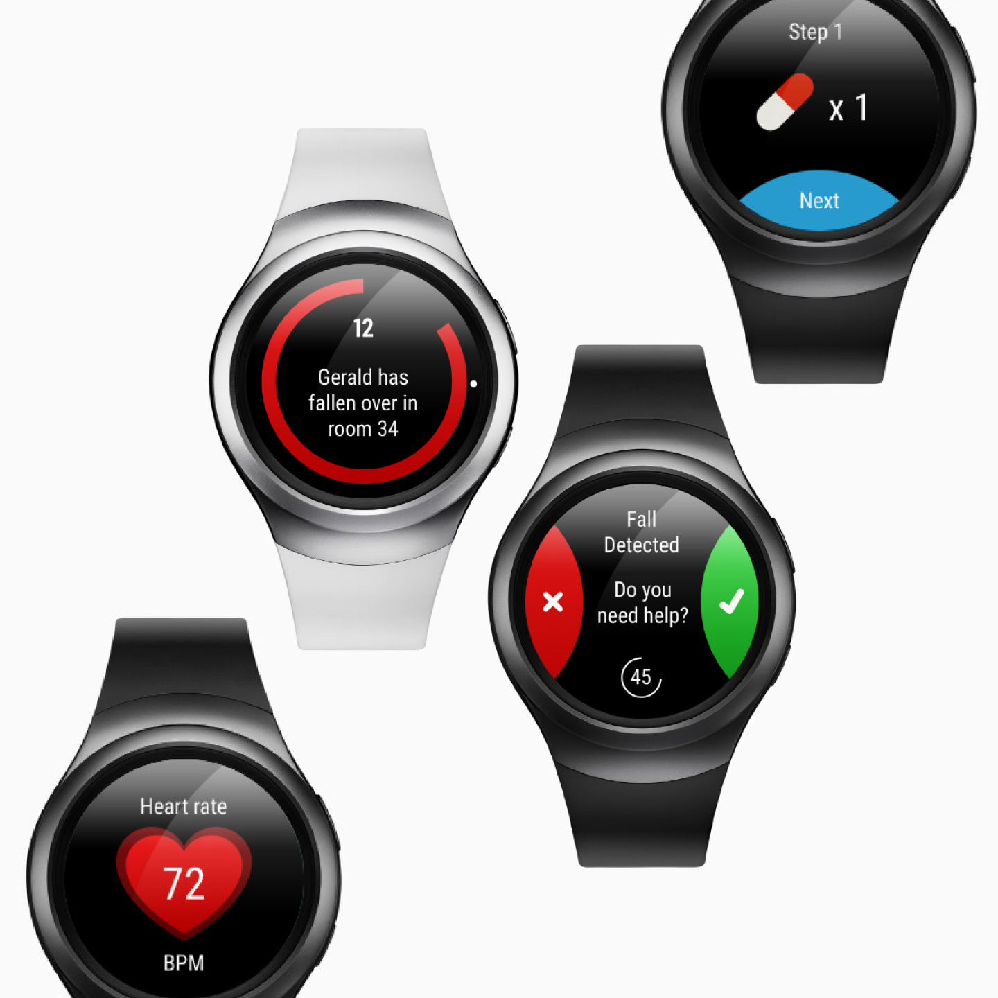
Another large project I worked on was a portal for a Samsung SmartThings dashboard to monitor and control devices on a large network for care homes. Administers would need ways to create rules and sets for the devices in their home or in a care home in an intuitive way. I also designed the packaging and much of the manuals and printed materials due to familiarity of the system.
AMBIO-N
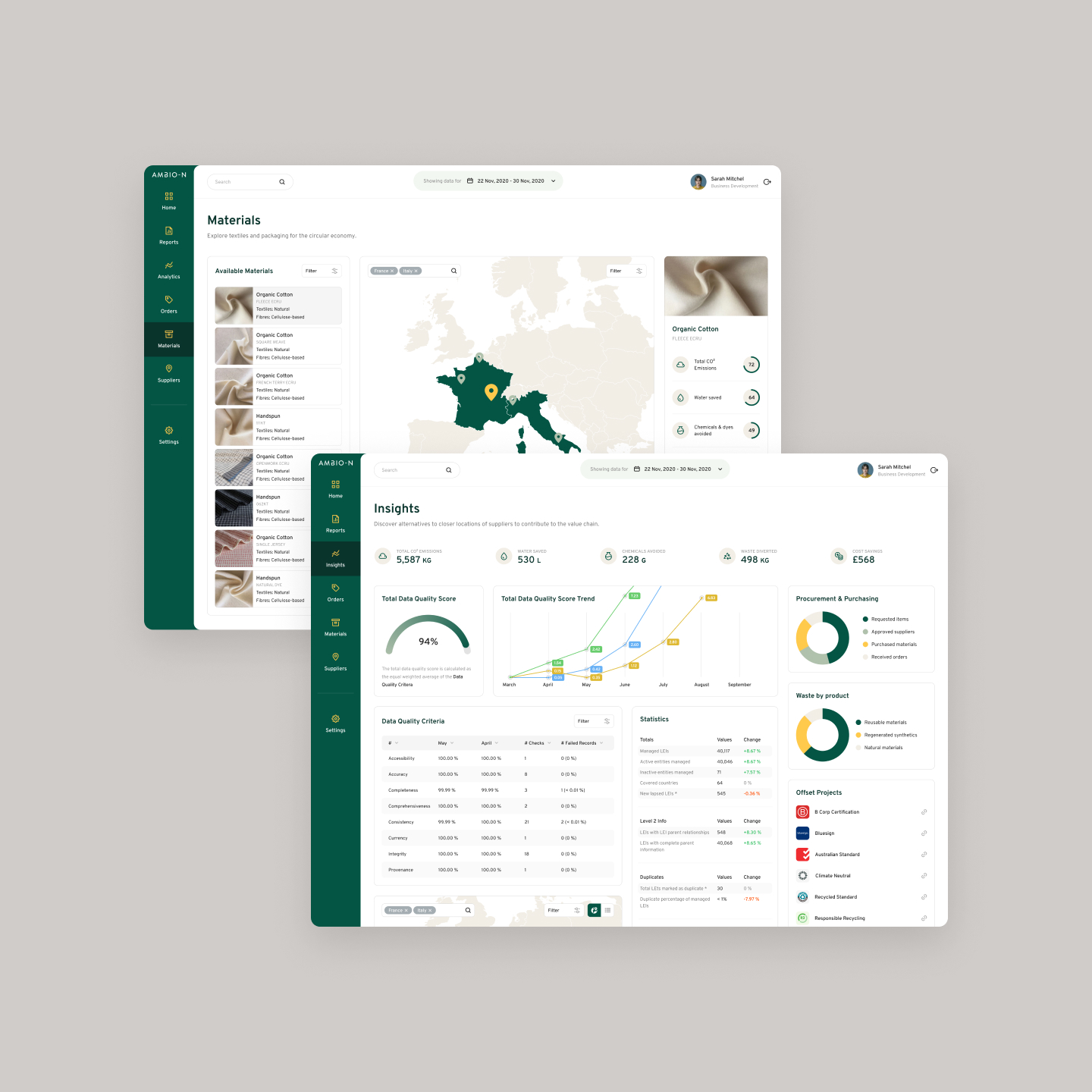
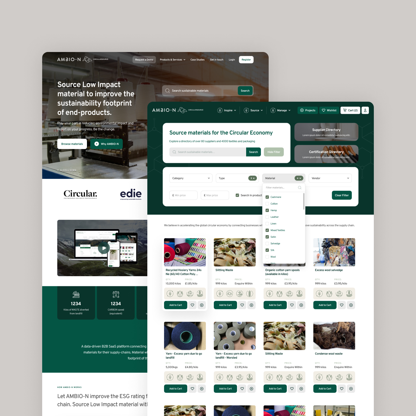
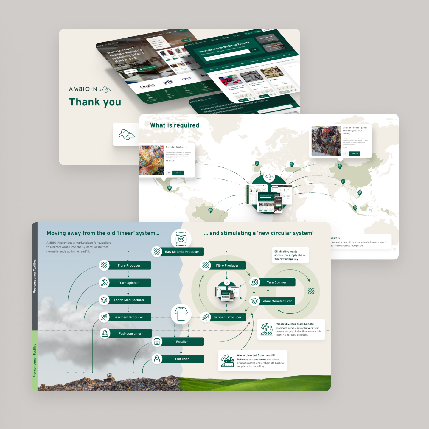
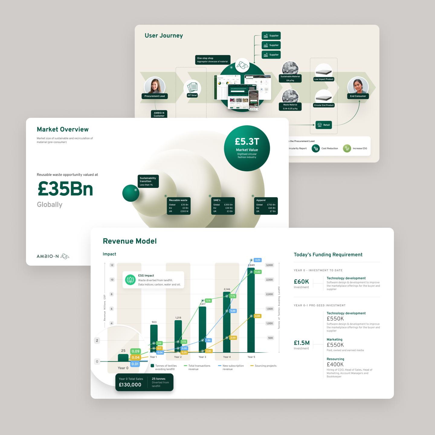
I have worked on design and UX for AMBIO-Ns marketplace website to maximise usability in users finding products in a large complicated marketplace, designing additional pages and updating their old design styles, reworking them into a new more consistent design system. Also worked on creating a more consistent brand across their materials and produced presentation decks and video marketing design.
Fabric

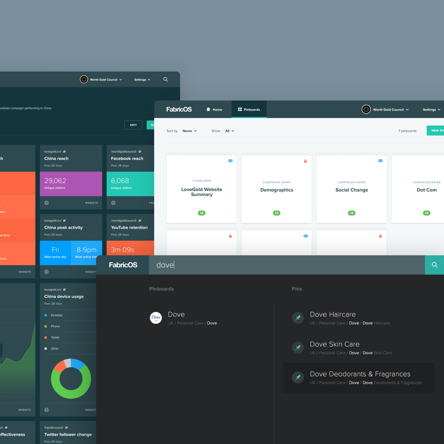
Design and UX for FabricOS, a data analytics platform targeted towards brand managers for large companies as a dashboard to manage and create reports from multiple sources like websites and social network pages.
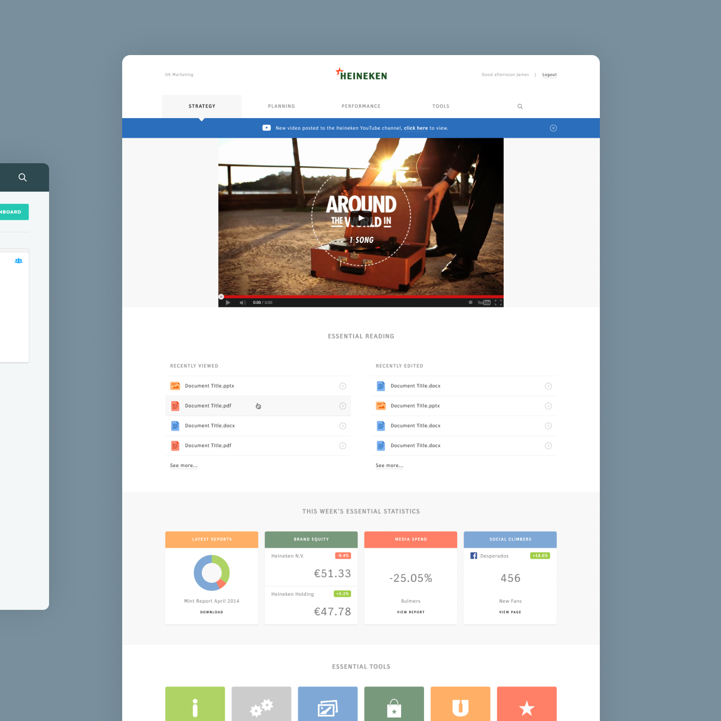
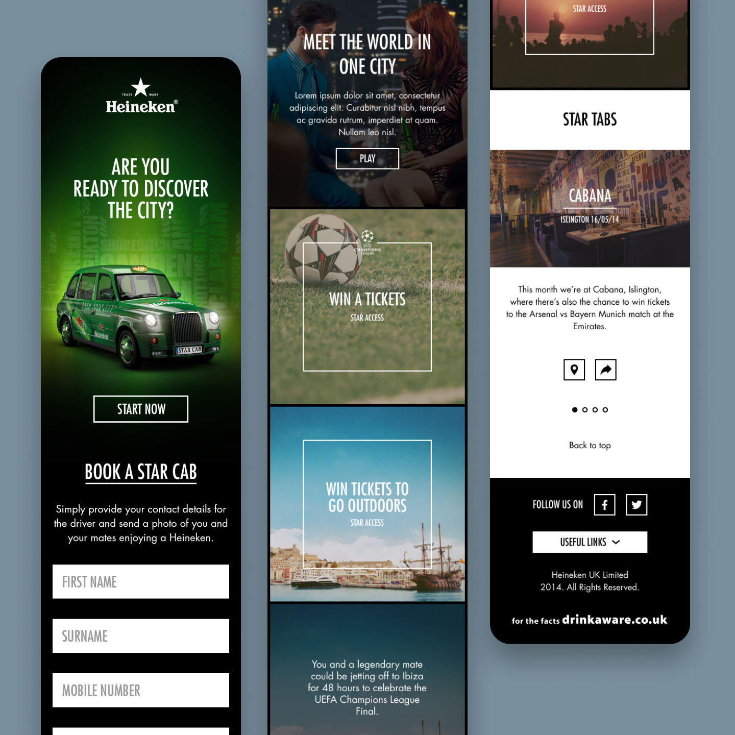
Maxus

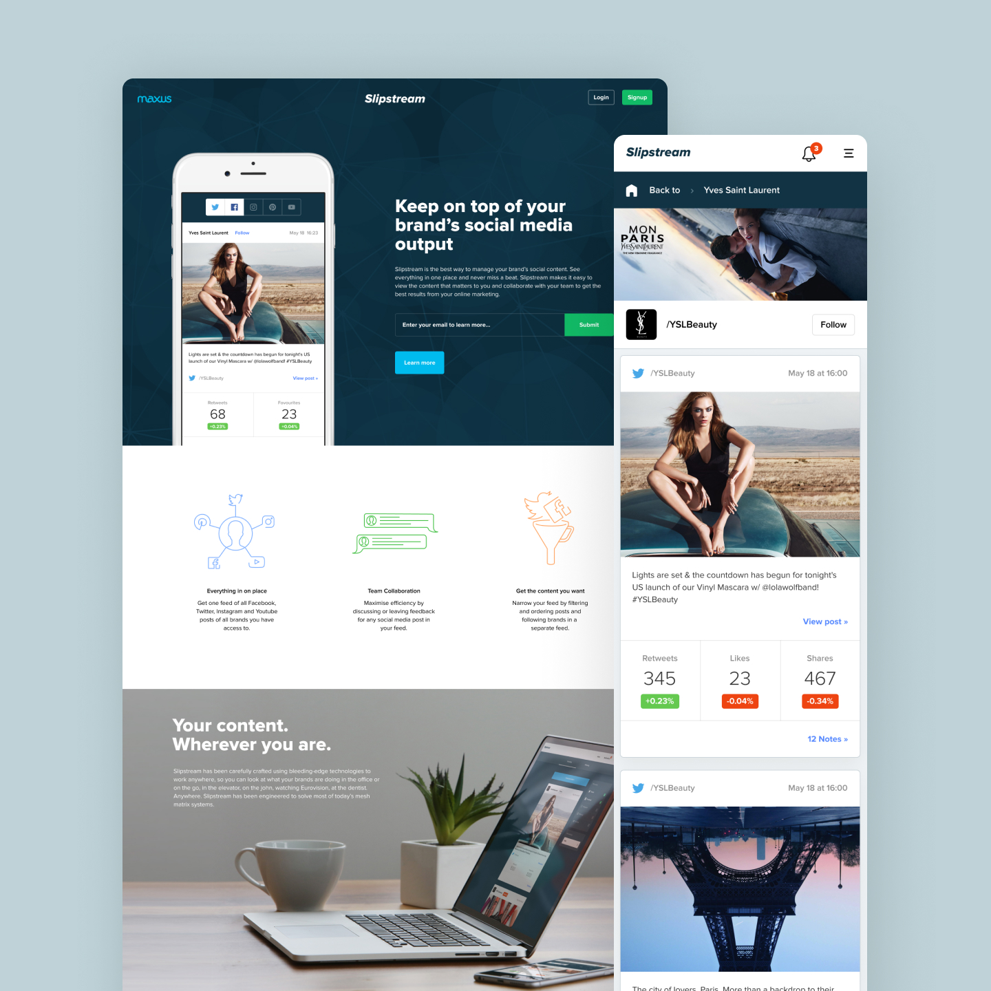
UX and UI Design and QA of data analytics platform for L’Oréal brands and design of a data analytics platform for BT.
QD Design
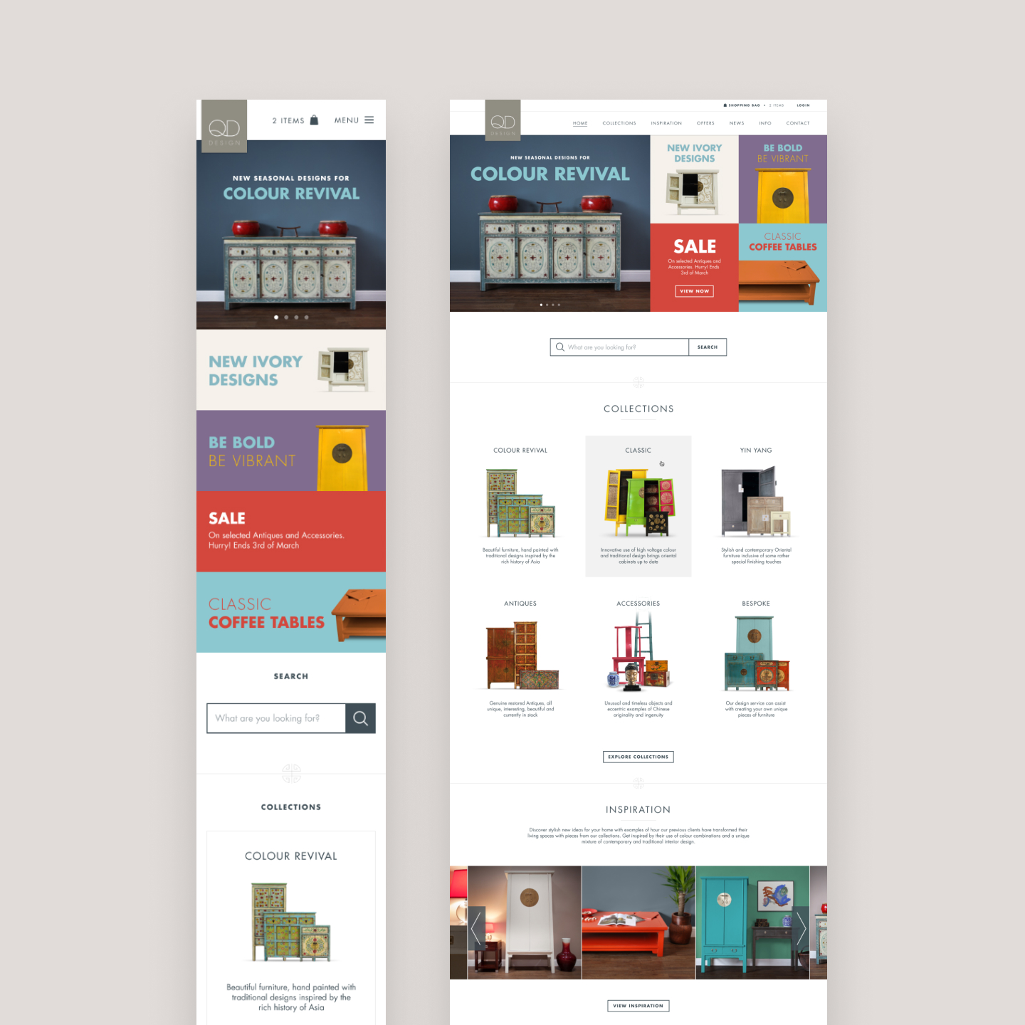
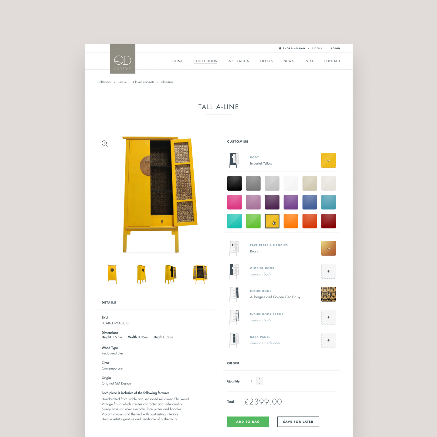
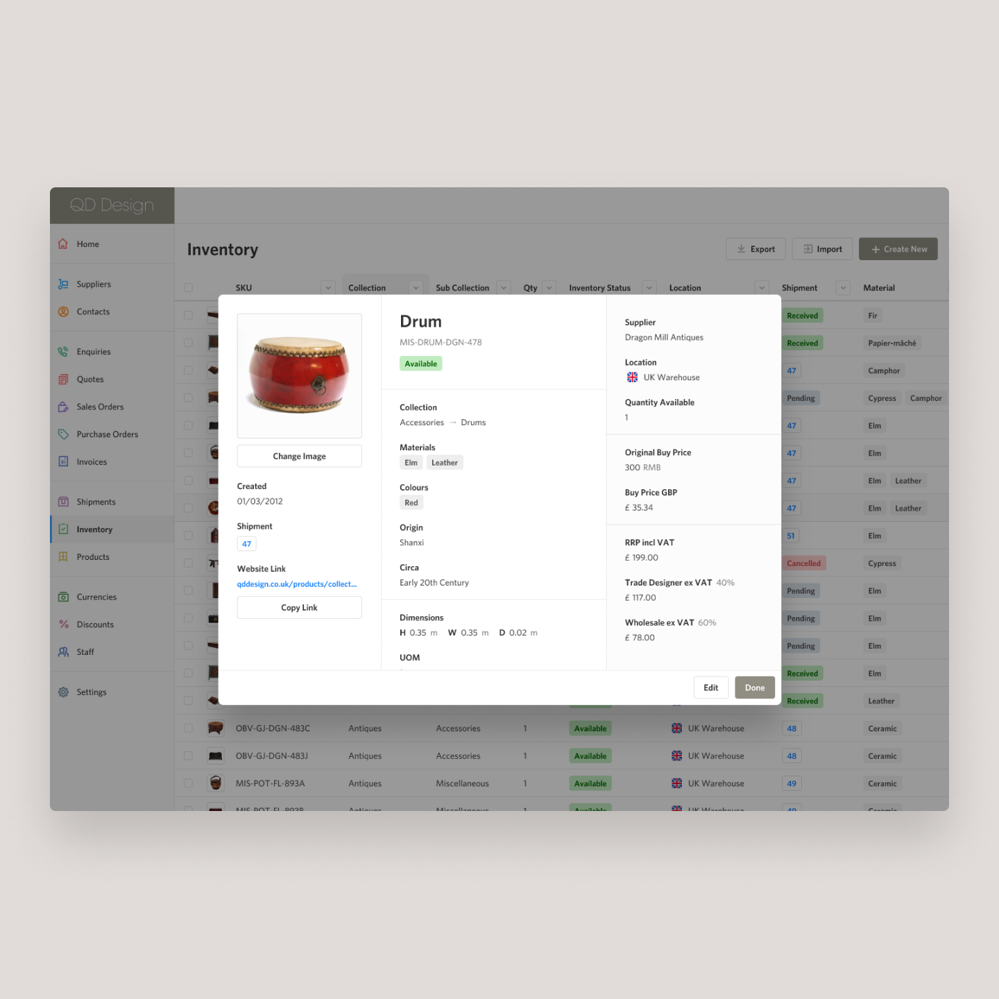
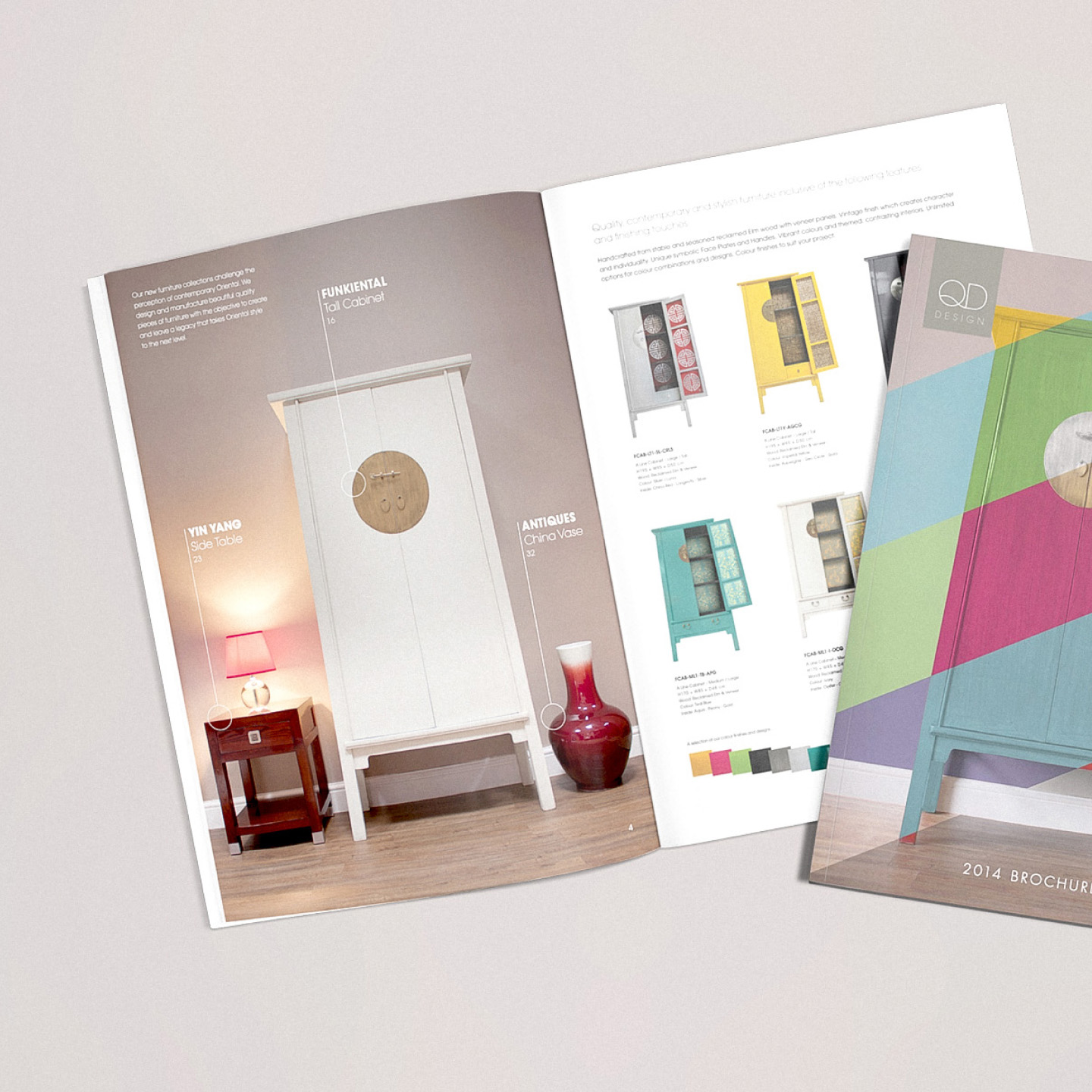
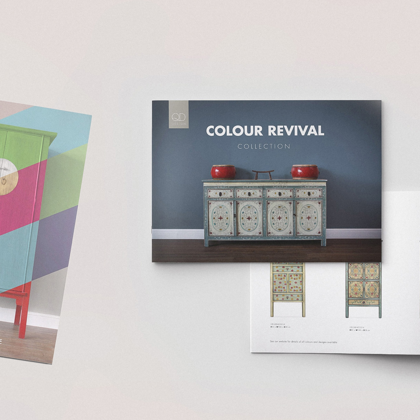
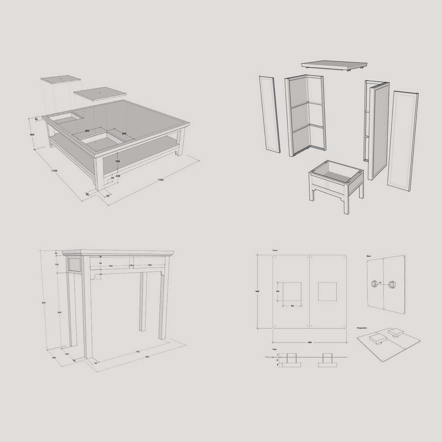
UX, UI design, development and operating of their ecommerce website. Digital and print design for rebrand and brand development. Design, layout for advertising and promotional materials also product photography, photo retouching of products as well as 3D CAD product design for furniture.
TMW
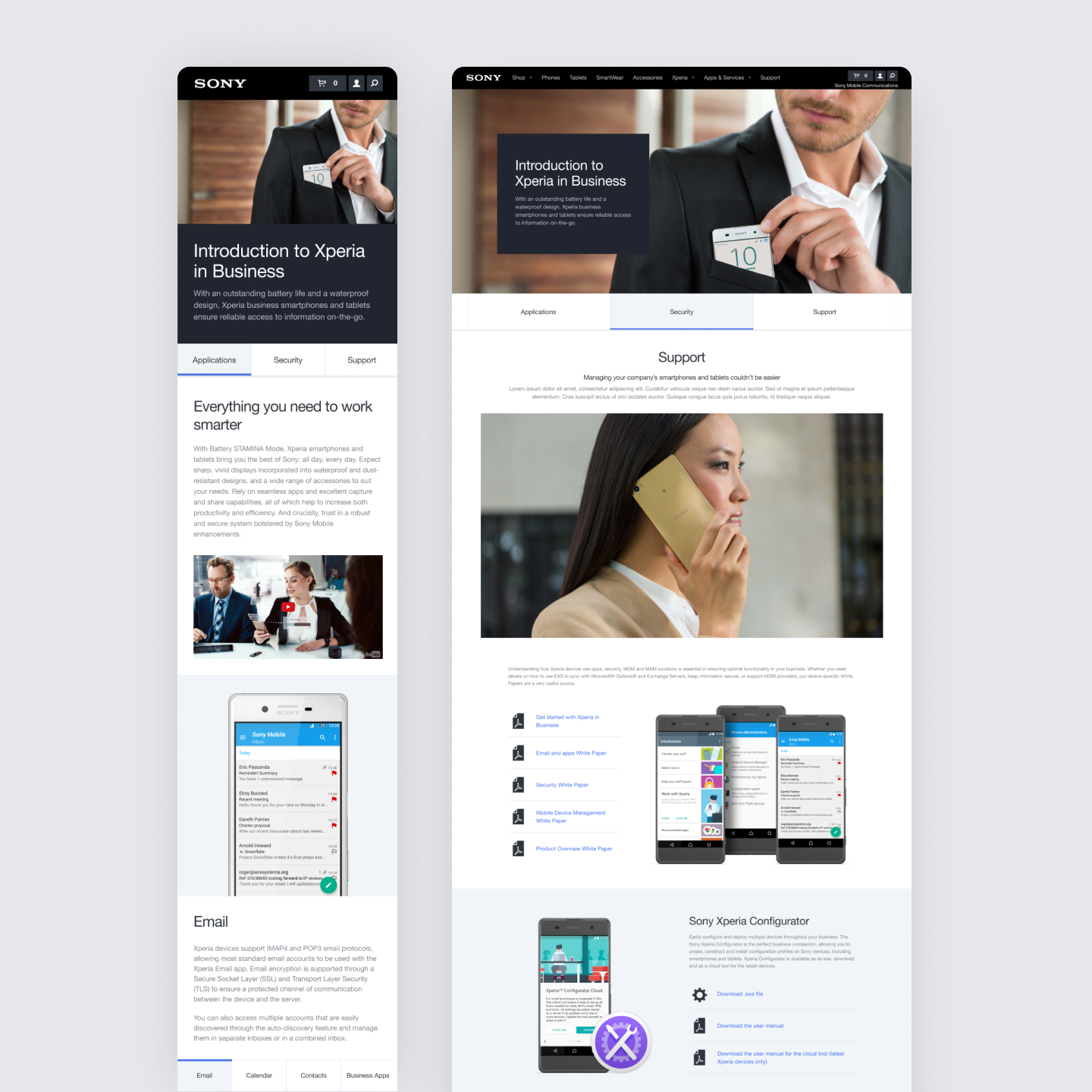
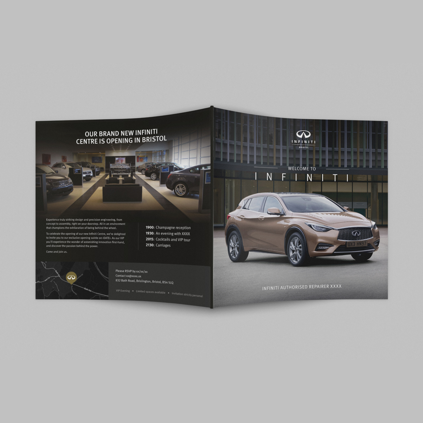
Artworking, UX and UI design for Sony Mobile, working with their UK website adding to their core page components and constructing new pages to design briefs as well as print design and campaign work for Infinit, Canon and HSBC.
Get in touch
